PANTONE 17-5104 Ultimate Gray + PANTONE 13-0647 Illuminating
‘Two independent colours that highlight how different elements come together to support one another’
Pantone Colours of the Year 2021
The 2021 Pantone colours of the year are vibrant, energising and bold, yet sturdy and everlasting, offering a contrast that works beautifully together. The warming tones of both colours are hopeful and dependable, encapsulating the optimism and security we desperately need going forward into 2021. We love the combination of these colours and are super excited to see these colours playfully splashed across the design scene this year.
Whilst strong colours are less common and less desired in a residential setting, an office space gives you the freedom to express yourself and your company using colour, tone and texture. Each company has a set of brand colours that they often like to stick to within an office and more often than not, at least 2 of those colours will be something you may consider bold. However, if for example your dominant brand colour is PANTONE 13-0647 Illuminating, we are not suggesting you paint every wall and lay every carpet in this same yellow to ensure you ‘stick to brand guidelines’. If this is something you desperately want to do, go for it, but I would probably keep reading on for a few more ideas first..
We understand that using bold colours can be quite daunting, especially in large, open plan spaces and even more so if you’re looking for a flexible area that can be updated regularly, easily and within a small budget. But don’t panic. Here are our top tips on how to add bold colour to your office:
- Furniture is the best way to add subtle pops of colour to a space if you’re not wanting to overdo it or you have a smaller space to work with. When choosing coloured furniture, make sure you check out all the RAL colours and different metals that can be used on the frames and legs as well as fabrics! Printing coloured graphics onto glass table tops also adds that wow factor to meeting rooms and breakout spaces.
- Feature carpets are great for adding colour and texture, and zoning a large open plan area, especially when used as a walkway to wayfind around the office. Adding shapes of different coloured carpets under breakout areas and desks looks very cool, whilst also splitting the room up into activity-based, agile spaces. In simple meeting rooms, add a carpet border in a different colour to add colour and interest to the room.
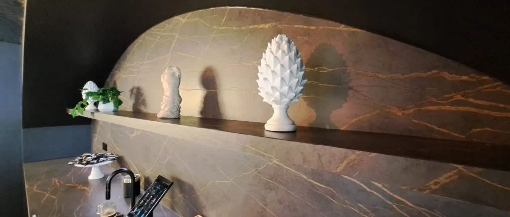
- Wallpaper is often overlooked. Many people think wallpapers are a bit dated and prefer simple paints or graphics. To those people, you are wrong. Other options are great for adding colour but wallpaper is amazingly versatile, transforming a space instantly with textures that painted walls cannot compete with. Make sure you get a selection of commercial grade samples to try out!
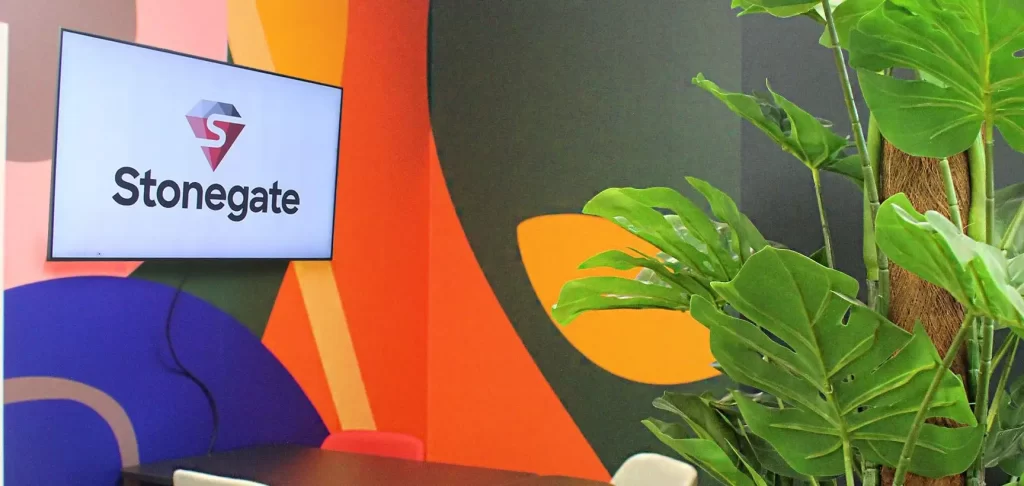
- Biophilia undoubtedly adds colour to a space but if you’re thinking of something a little bolder or more colourful than a standard green plant, check out all they different colours of dyes you can have on a moss wall – you can even get your logo dyed into it which looks very impressive. Make sure you also check out all the colours available for planters and storage planters. Bright, bold colours contrast brilliantly with the natural aesthetic of plants, real or artificial.