When you step into an office, colour is one of the first things you notice. The right colour scheme doesn’t just make a space look good, it sets the tone for how people feel and work within it. From productivity and collaboration to brand expression, colour plays a far bigger role than most realise.
At Metirium, we’ve seen first-hand how carefully chosen palettes can transform a workplace. Whether bold and energetic, calm and neutral, or sleek and modern, colour is one of the most powerful tools in shaping the environment and aligning it with your company’s identity.
How Colour Influences the Workplace
- Mood & Atmosphere: Blues and greens are known to promote calm and focus, while brighter shades like yellows and oranges can boost creativity and energy. Neutral palettes, on the other hand, create a professional and timeless look.
- Space Perception: Light colours can make a room feel larger and more open, while darker tones can bring a sense of intimacy or sophistication.
- Workplace Culture: Colour directly feeds into how employees experience their workplace. A vibrant palette may suit a fast-paced, creative team, while softer tones may better reflect a detail-oriented, focused environment.
Colour as a Reflection of Brand
An office is a physical extension of your brand. The right colour scheme ensures consistency between your values, your visual identity, and the experience of stepping into your space.
- Brand Recognition: Incorporating brand colours into key features – walls, furniture, signage, and accents – helps create instant recognition for staff, visitors, and clients alike.
- Subtlety vs. Statement: You don’t need to paint every wall in your brand’s boldest colour. Sometimes, subtle accents paired with a supporting palette can create a more sophisticated, lasting impression.
- Tailored to the Team: Your colour scheme should inspire your people as much as it reflects your logo. The right balance keeps employees engaged and proud of their environment.
Examples from Our Work
We’ve had the privilege of creating offices where colour schemes became a defining feature of the space:
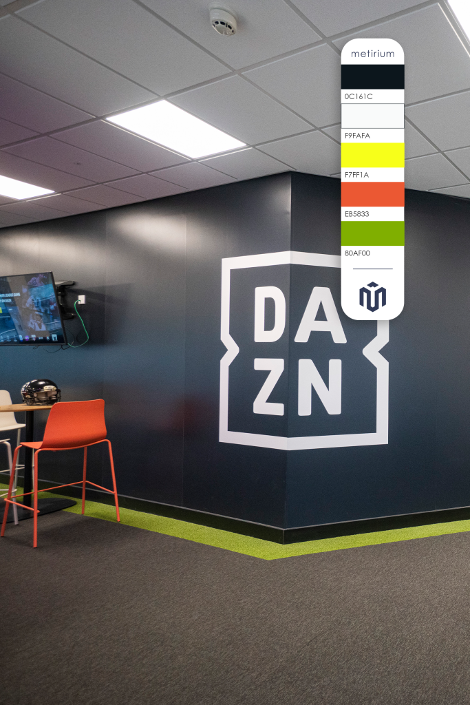
DAZN
A sleek, modern environment brought to life with a strong monochrome palette and subtle injections of bold colour, mirroring their energy as a leading digital sports broadcaster.
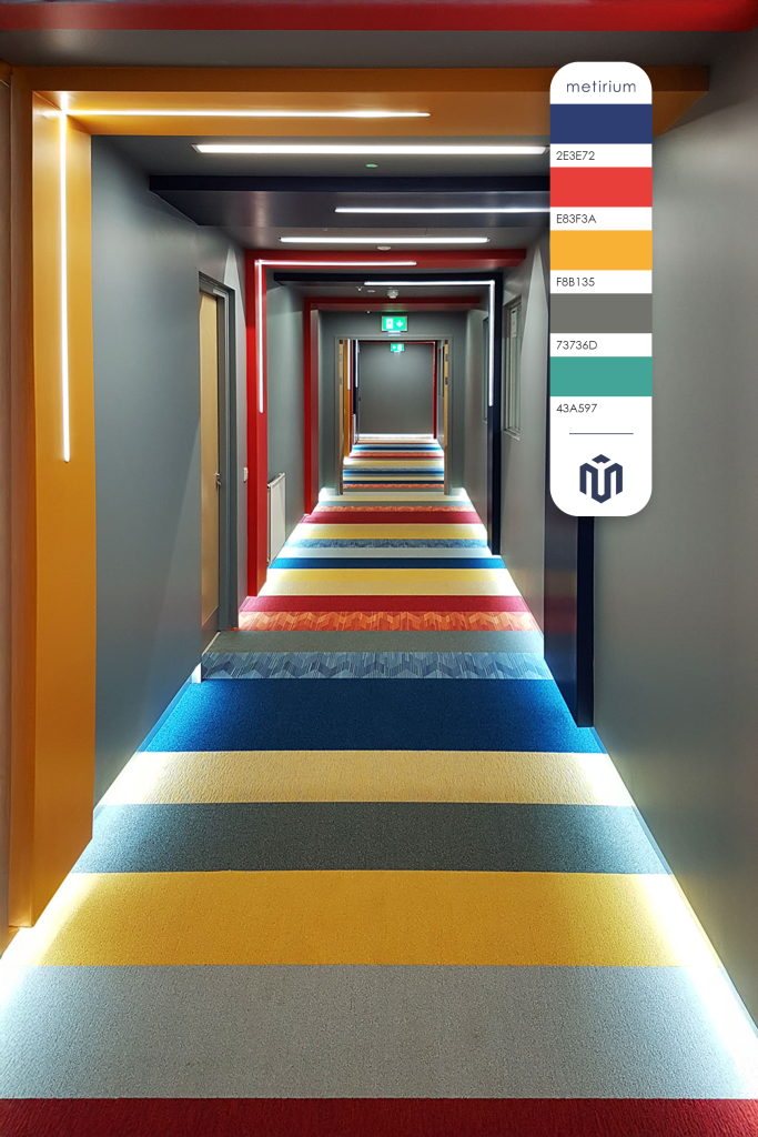
Jotun
A vibrant workplace where colour celebrates their identity as a global paint manufacturer, with dynamic accents energising the space while staying true to their brand DNA.
Stonegate Precision Tools
A functional yet inspiring office that blends neutral tones with brand highlights, creating a balanced environment that supports productivity and innovation.
Getting Your Colour Scheme Right
When planning your office fit-out, colour shouldn’t be an afterthought – it should be part of the design conversation from the very beginning. To ensure your colour scheme enhances your workplace and matches your brand:
- Start with Your Brand Guidelines – Use them as an anchor, but don’t feel limited; supporting colours can add depth.
- Think About Functionality – Different spaces within the office may benefit from different palettes. For example, calming tones in meeting rooms and energising colours in breakout areas.
- Balance Aesthetics and Practicality – Striking colours can inspire, but too much can overwhelm. A thoughtful mix creates harmony.
- Consult the Experts – Designers can help translate your brand and culture into a palette that feels both intentional and impactful.
Final Thoughts
Colour is more than decoration – it’s a tool for shaping experience, communicating brand, and inspiring people. Whether subtle or bold, the right palette can transform your office into a space that not only looks the part but feels like home to your brand and your team.
Looking for a team that can add some colour to your workspace? Contact us using the form below!